Attendee experience is often discussed as if it lives in branding, stage design, or a single standout moment.
In practice, it is usually built, or damaged, through operations.
Registration clarity, arrival flow, badge pickup, wayfinding, session transitions, staff handoffs, app usefulness, queue management, and post-event follow-up all shape how the event actually feels.
Recent industry discussion around experience design is a useful reminder that attendee journey planning should not sit at the edge of event delivery. It should sit near the center of it.
A seamless event rarely feels complicated to the attendee. That is usually because the complexity was handled well behind the scenes.
Why this matters
Attendees do not experience an event as separate departments.
They do not think in terms of registration, content, venue operations, sponsor delivery, and communications as isolated workstreams. They experience one connected journey.
When the journey breaks, the symptoms are familiar:
- uncertainty before arrival
- longer queues and slower entry
- missed sessions or late starts
- more pressure on front-line staff
- lower confidence using the app or agenda
- weaker exhibitor and sponsor engagement
- a more fragmented event overall
This is why experience design matters operationally. It helps teams reduce friction across the small moments that shape the day.
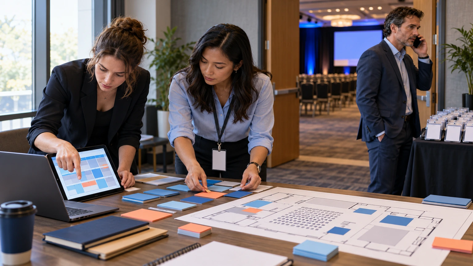
Start by mapping the attendee journey end to end
A common mistake is improving individual touchpoints without reviewing how they connect.
A registration page may be clear on its own. A badge process may work on its own. The event app may look polished on its own. But if the handoffs between them are weak, the attendee still feels friction.
Start with a simple journey map that covers the full attendee path:
- discovery and decision
- registration and confirmation
- pre-event preparation
- arrival and entry
- navigation on site
- session and meeting participation
- breaks, networking, and exhibition time
- departure and follow-up
For each stage, ask two questions: what is the attendee trying to do, and what might get in the way?
Design for moments, not just channels
Many event teams organize planning by channel: email, website, app, signage, help desk, venue screens.
Attendees organize their experience by moment.
For example, the arrival moment may involve:
- a reminder email
- a QR code or ticket
- transport or parking information
- entrance signage
- security or bag check
- badge collection
- staff instructions
If those elements are owned separately and not designed together, the attendee carries the burden of joining them up.
The attendee journey does not care which team owns the touchpoint. It only reflects whether the experience feels connected.
Focus first on the highest-friction points
Not every touchpoint needs the same level of redesign.
Start with the moments where operational friction has the biggest impact. In many events, those include:
1. Registration and confirmation
People should quickly understand what they registered for, what happens next, and what they need to bring or do before arrival.
Check for common issues such as:
- unclear ticket or pass types
- missing arrival details
- buried venue information
- weak calendar or agenda prompts
- too many follow-up emails with overlapping information
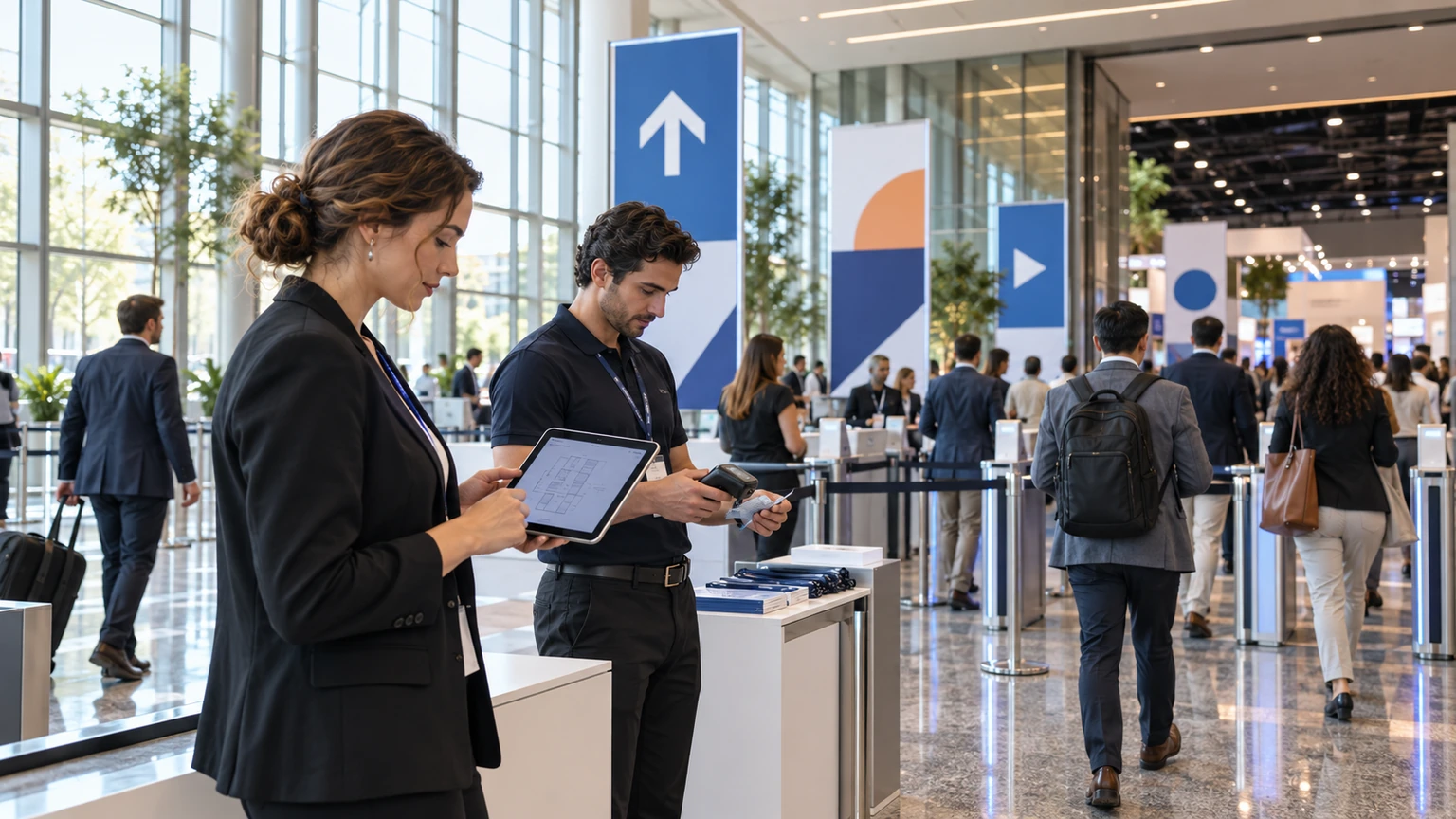
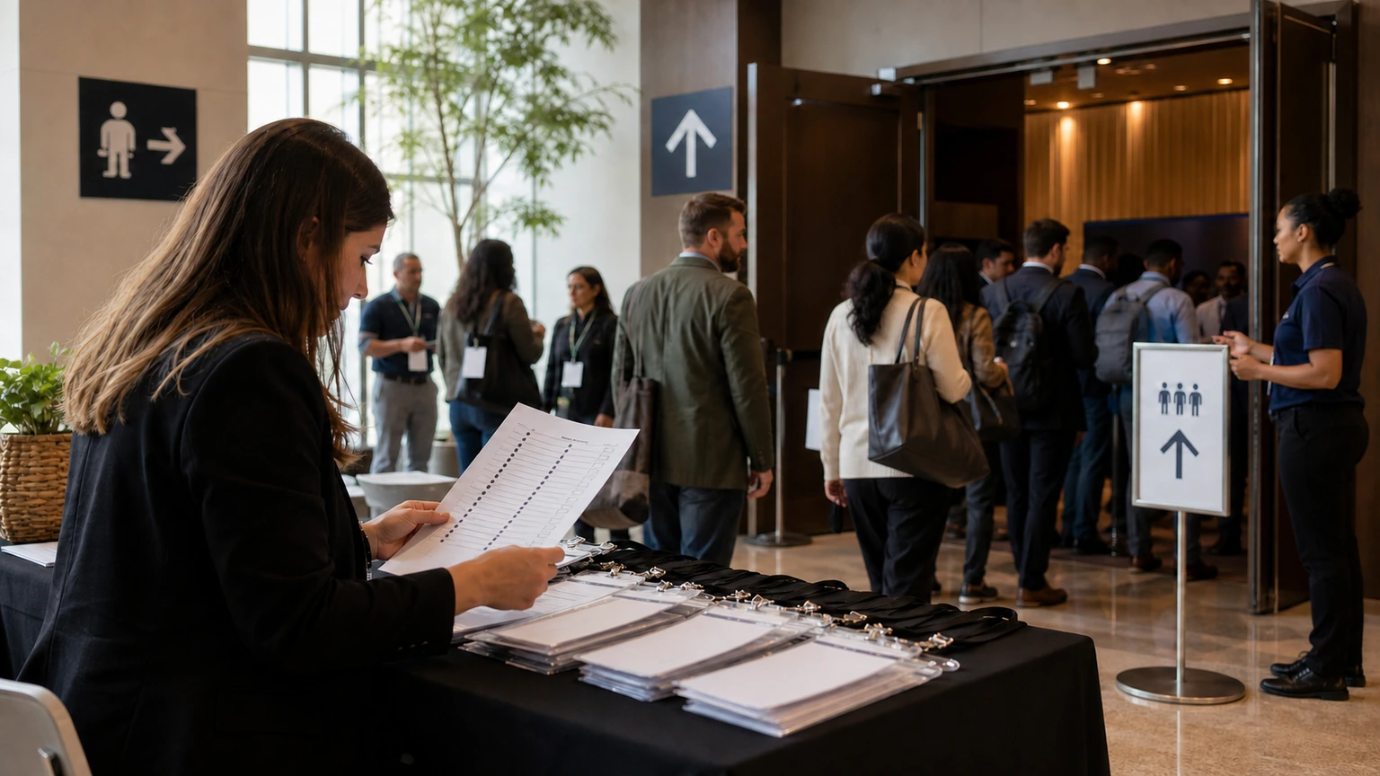
2. Arrival and badge pickup
This is often where attendee confidence is formed early.
If the entrance is hard to find, queues are poorly split, or badge rules are not clear, the event starts with stress.
Useful checks include:
- are attendee types routed clearly
- are staff briefed on exception handling
- is signage visible before people reach the choke point
- is there a fast answer for common questions
- is backup capacity available if demand spikes
3. Wayfinding and session transitions
Even strong content can feel weaker if people struggle to reach the right room at the right time.
Review whether attendees can easily understand:
- where they are now
- where the next session is
- how long it will take to get there
- whether any room changes have happened
- which entrances or floors matter most
4. Breaks, networking, and expo movement
These periods are often treated as informal, but they need structure too.
If traffic flow is awkward, seating is limited, food points create bottlenecks, or networking areas are unclear, attendees feel the event is harder to move through than it should be.
Make information easier to act on
Attendees rarely need more information. They usually need clearer next steps.
This means each touchpoint should help people do something specific.
Examples:
- confirmation emails should make arrival requirements obvious
- event apps should surface the next useful action quickly
- signage should answer immediate directional questions
- staff scripts should solve repeated uncertainties consistently
- session updates should be timely and easy to interpret
Good experience design is often less about adding content and more about reducing hesitation.
Build handoffs between teams, not only tasks
Many attendee journey problems appear at the boundary between teams.
Marketing sends one message. Registration operates another process. Venue staff receive a different briefing. App updates happen elsewhere. On-site support then absorbs the confusion.
To reduce this, define operational handoffs around the attendee journey.
For key moments, clarify:
- who owns the message
- who owns the process
- who handles exceptions
- who updates live information
- who makes the final call when conditions change on site
This is especially important for high-pressure periods such as opening morning, room resets, peak catering times, and large session turnarounds.
Use front-line observations as design input
Some of the best attendee journey insights come from the people who deal with confusion in real time.
That includes:
- registration desk staff
- room managers
- volunteers
- security teams
- help desk staff
- exhibitor support teams
Ask them where attendees get stuck, what they ask most often, and which moments create avoidable pressure.
If the same question appears repeatedly, the issue is usually not the attendee. It is the journey design.
Plan for emotional friction, not only process friction
Operational teams are good at spotting broken steps. It is also worth looking at moments where the process works technically but still feels uncertain.
Examples include:
- not knowing whether registration was completed correctly
- arriving and not being sure which queue is the right one
- walking into a large venue without clear orientation
- trying to choose between parallel sessions too quickly
- not knowing where to go for help
These moments matter because uncertainty changes behavior. People stop, ask staff, form clusters, block flow, or abandon useful parts of the event.
A practical attendee journey should reduce both delay and doubt.
Create a simple experience design review for every event
Experience design does not need to become a large theory exercise.
For most event teams, a short operational review is enough if it is used consistently.
A practical review can include:
- the top five attendee tasks before the event
- the top five attendee tasks on site
- the top friction points from past editions
- the most important handoffs between teams
- the highest-risk congestion or confusion moments
- the live information sources attendees will rely on
- the escalation path when the plan changes
This creates a shared view of the journey instead of leaving each team to optimize its own piece in isolation.
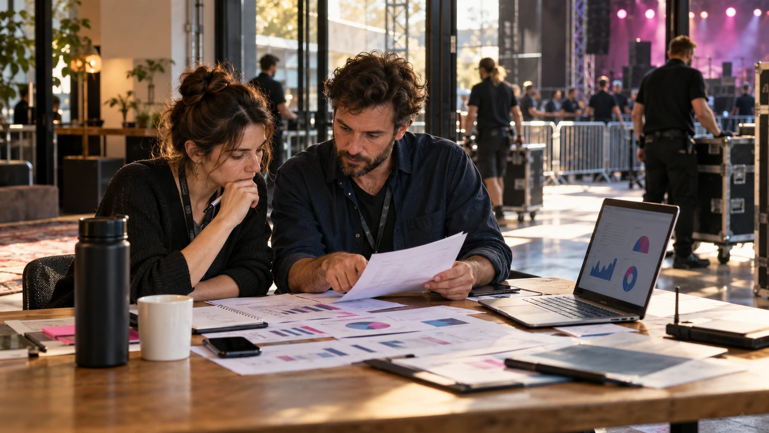
Measure whether the journey actually worked
Attendee experience should not be judged only by general satisfaction scores.
Look for practical indicators such as:
- queue times at peak moments
- support questions by category
- missed or delayed session starts caused by movement issues
- app usage on high-need screens
- wayfinding complaints or confusion hotspots
- badge reprint or exception volumes
- post-event feedback about clarity, ease, and confidence
These signals help teams improve the journey with more precision.
Common mistakes to avoid
- treating attendee experience as a branding layer instead of an operating model
- designing channels separately instead of designing moments
- focusing only on headline features, not handoffs and transitions
- assuming staff can fix preventable confusion on site
- waiting for post-event surveys without reviewing live friction
- making the journey more complex in the name of personalization
What this means for event teams
If every touchpoint is part of one attendee journey, then experience design is not an optional creative exercise. It is part of event operations.
The goal is not perfection at every moment. The goal is a journey that feels clear, connected, and easy to move through.
When that happens, attendees feel more confident, staff spend less time repairing confusion, and the event creates more space for the parts people came for in the first place: learning, meetings, discovery, and participation.
That is what a seamless attendee journey really looks like. Not one impressive moment, but a series of well-run ones.